
Federalist Reader
Read the Federalist Papers as 1787 newspapers
18 followers
Read the Federalist Papers as 1787 newspapers
18 followers
All 85 Federalist Papers as the newspaper serial they originally were: period typography, a clean reader mode, short companion notes, and an email subscription that delivers one paper a week, or each on the anniversary of its original 1787–88 date.




Free
Launch Team

Render: Get up to $100K in startup creditsCloud infrastructure for founders who want to move fast and NOT break things
Promoted
The anniversary email timing is such a cool touch. One thing I'd love is a small "context map" at the start of each paper showing where it falls in the broader argument between Hamilton, Madison, and Jay, so I can follow the back-and-forth across weeks instead of reading each one in isolation.
@mutugantan82154 Thank you! Fun twist in the actual history: the back-and-forth wasn't between the three of them. Hamilton, Madison, and Jay wrote as a single voice, "Publius," and coordinated so tightly that historians still argue over who wrote about a dozen of the essays.
The real sparring partners were the Anti-Federalist writers (Brutus, Cato, Federal Farmer), publishing rebuttals in the same New York papers, sometimes the same week.
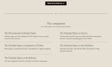
But the need you're pointing at is real. Hamilton actually laid out the plan for the whole series in Federalist No. 1, so a small "where we are in the argument" marker on each paper is doable. It's going on the list. (The themed guides and the notes on each paper cover some of this today, but a per-paper map would be better.)
Longer-term dream: pairing papers with the Anti-Federalist essays they were answering, so you really can follow the fight across the weeks. But that is going to take some work. The Anti-Federalist papers aren't nearly as well defined and came out in a myriad of ways. Sometime! Thanks for the push.
love how the period typography actually makes these feel like i am reading a 1787 paper rather than a modern website. the anniversary-based email subscription is a really thoughtful touch too.
@tansut69872 Thank you! That's exactly the feeling I was chasing. The look and feel got an honestly embarrassing share of the total hours. The type is IM Fell English and Caslon, self-hosted, with the period ligatures and the long-œ "FŒDERALIST" heading intact. I decided against some of the more period typography elements, like S's that look like f's, as they made it difficult to read.
And you might have spotted another detail: the aging is unique to every paper. Each of the 85 gets its own wear fingerprint generated from its paper number at build time - its own edge nicks, its own corner softness, and about two in three sheets have a lifted corner. No two papers match, but the wear is stable. No. 10 looks like No. 10 on every visit, like a real sheet that's been sitting in the same drawer. Compare the corners of any two papers sometime.
Glad the anniversary program landed too. The season opens October 27, the same day it did in 1787.
Still not as nice as having physical copies (the originals! ... or the reproduction ones that LetterJoy produces), but I think a lot better than the generic text you get from other sites.
Closing note after launch day: Thank you!
This was a quiet little launch for a 239-year-old serial, and the conversations here were better than I hoped: typography deep-dives, authorship discussions, and two feature ideas that are going on the roadmap.
If the reading rhythm appeals to you: one paper a week by email, or each paper on the anniversary of its original 1787–88 date. Free, no account, at https://federalistreader.org/subscribe/. And if nothing else, just go to read them online at your leisure. Or follow along on X to hear about the progress of the Constitutional Convention and lots of interesting facts about the papers: https://x.com/ReadPublius
The papers have waited 239 years; they'll be there when you're ready. Thanks for reading.