
Launched this week

ChartStud
Turn messy data into clear decisions in minutes
100 followers
Turn messy data into clear decisions in minutes
100 followers
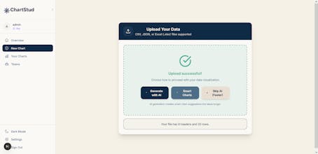
ChartStud helps you turn raw data into beautiful charts, dashboards, and AI-powered insights. Connect your data, clean it automatically, and discover patterns in seconds.


ChartStud
ChartStud
@bengeekly Thank you so much! 🙌
Currently, ChartStud supports:
• CSV
• Excel
• JSON uploads
You can also connect and analyze data exported from platforms like Google Ads, Meta Ads, and other marketing tools.
We’re now working on direct integrations with ad platforms, databases, and APIs so teams can connect live data without manual exports.
JumprAI
Cool project ! Can't wait for what's to come !
ChartStud
@itsmasa Thank you! 🙌 More coming very soon!
Love the mission here. Turning analytics into a conversation instead of a technical hurdle is exactly what non technical teams need. The text to chart angle is especially powerful if positioned right. As a copywriter who helps SaaS founders clarify complex products and drive adoption, I’d be happy to share ideas on sharpening the messaging so the value feels instantly obvious to marketers and operators.
ChartStud
@copywizard Thank you so much — this really means a lot
@aronsmith This looks super useful for non-technical teams. I love the plain-English approach to creating charts makes analytics way more approachable. Can’t wait to try it with some messy CSVs and see the insights it generates!
ChartStud
@iimedr Thanks so much, really appreciate that!
Very nice, could see this being huge for marketing who today have to bug engineering for the smallest requests
ChartStud
@willsmithte Thanks a lot! 🙌 Totally agree — marketers shouldn’t have to rely on engineering for every small data question.
The plain-English to chart flow is compelling. How are you handling ambiguity in prompts so non-technical users still get statistically sound outputs?
ChartStud
@justin_press We’re handling ambiguity in a few ways to keep outputs clear and statistically sound for non-technical users:
Clarifying questions when needed: If a prompt is vague (e.g., “show performance”), ChartStud asks a quick follow-up like which metric, time range, or segment you mean.
Smart defaults: When possible, we apply sensible defaults (e.g., recent time range, most relevant metric) so users still get useful results fast.
Chart + explanation together: Every chart comes with a short explanation of what’s being shown and any assumptions made, so users understand the context.
Guardrails on analysis: We avoid over-interpreting noisy data and surface basic statistical context (like trends vs. outliers) in simple language.