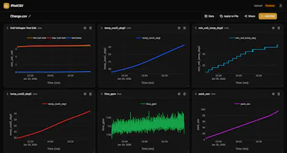
Ever export a CSV then blow 20 minutes fighting Excel charts or firing up a Python script just to look at your data? iPlotCSV is a web tool for visualizing CSVs. Drop your file, pick your columns, get an interactive chart. That's it. No signup. No installs. No scripts. Just your data, visualized, fast. Built for anyone who's ever struggled with CSV data visualization and collaboration!
No reviews yetBe the first to leave a review for iPlotCSV
Customer.ioAutomate Messaging Everywhere — Startups Get 12 Months Free
Promoted
Maker
📌
I spend a lot of my day staring at test data, sensor logs, and performance CSVs. My workflow used to be: export CSV, open Python, write a quick script, tweak the axes, realize I need to compare it to yesterday's data, write more code... all just to see what's going on. Don't even get me started on excel and google sheets!
I built iPlotCSV because I wanted something I could just throw a file at and immediately get a chart. No boilerplate, no environment setup, no "wait let me install pandas real quick."
The multi-file overlay came from a real need. I was constantly comparing datasets from different test runs and it was painful to do manually. Same with calculated columns. Sometimes you just need to divide two columns or convert units without going back to the source file.
I'd love to hear how you'd use it and what chart types or features would make this more useful for your workflow. Happy to answer any questions!