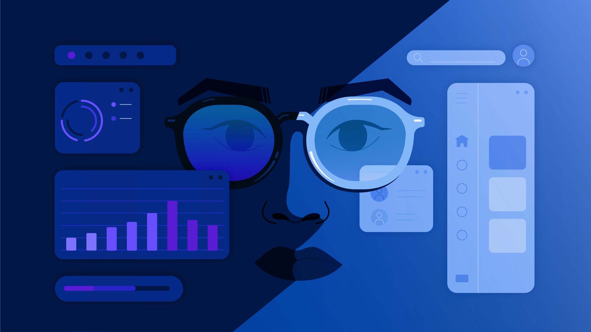
Does your product actually need dark mode?
If you’ve been building apps and have been around for a few key moments – say circa 2018-2019 – you might recall the current thing of those times, the dark mode.
This article originally appeared on the CommandBar blog.
Dark mode: origin story
2018-2019 is when both Apple and Google decided to introduce their versions of dark mode during their annual WDDC and I/O conferences. It didn’t stop (or start) there though. Most major players in tech sprinted to replace the traditional blinding white they were previously sporting with deep, soothing darkness.
What’s interesting about dark mode becoming the darling of product designers is the fact that, as with most other things that start as trends, they’re usually nothing new. White text on a dark background is very much reminiscent of the early days of personal computing when most operating systems didn’t have much choice but to display hues of white, green, or amber on black screens. This was due to the type of technology early monitors used – cathode ray tubes which had a luminescent coating inside emitting a greenish glow. What we think of as the “hacker aesthetic” was actually a byproduct of the technology available to early generations of software developers and users.
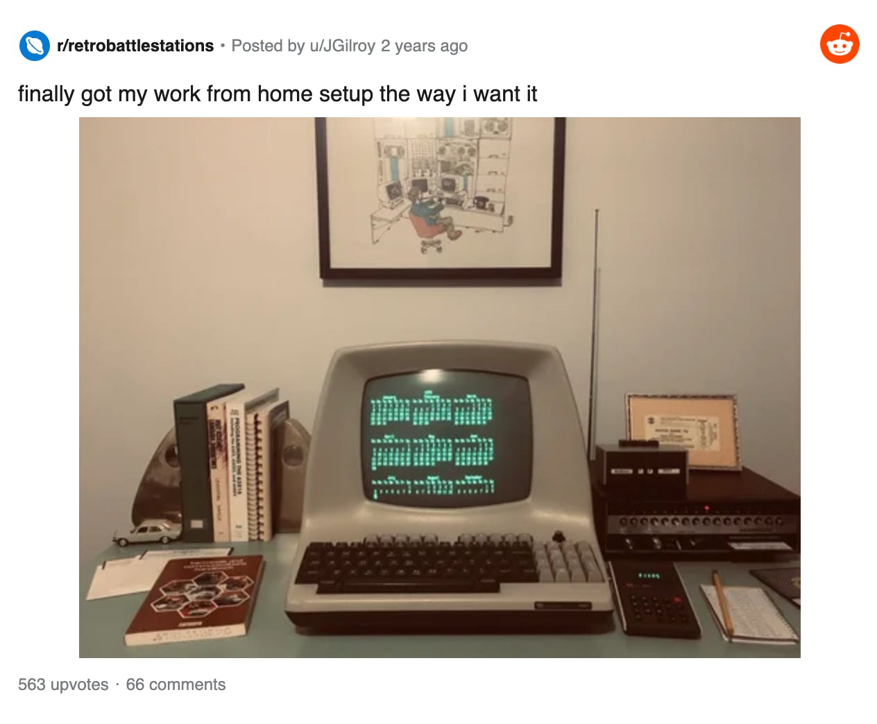
ADM-5 terminal, first introduced in January 1981
These early beginnings make it difficult to pinpoint the exact origin story of the dark mode we know today. Some digging into the deep archives of the Web shows that today’s dark mode was born with a utilitarian mindset.
In 2017, French designer Sylvain Boyer started an artistic movement under the name of “eco branding.” He redesigned the logos of big brands (McDonald’s, LV, Starbucks) using up to 40% less ink. One year later, he extended the dark mode concept to the digital world, introducing FriendlUi — “an eco-friendly and user-friendly user interface for smartphone that saves battery life and limits power consumption thanks to a simple graphic design process.”
It didn’t take much longer for the rest of the tech world to follow suit. Also in 2018, YouTube added the optional dark theme to its apps and Samsung released a dark One UI. Google, Apple, and Reddit were next in 2019 when the popularity — or at least the trendiness — of “dark mode” peaked.
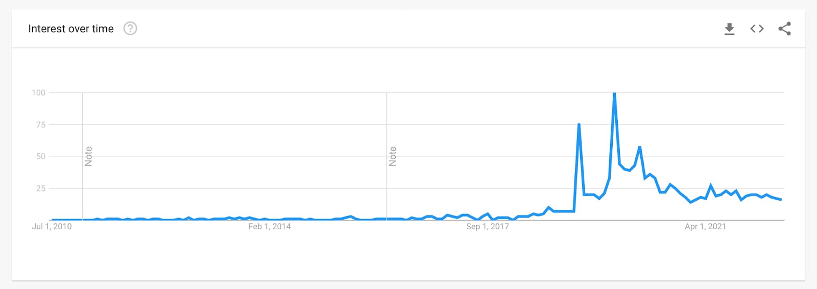
Google Trends search for 'Dark Mode'
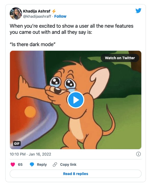
Nowadays, it seems like whenever products default to light mode at launch, there is almost always that one person asking the team when and if dark mode is coming. Is it because we’ve just got used to seeing dark mode and now expect it? Is it just a trope? Or do we actually fundamentally need it from a usability standpoint? That’s what most product teams ask themselves whenever feature requests pile on.
Our thoughts? Dark mode is like being friends with the cool kid. You’ll probably get some attention and gain some popularity in the short term, but will they be there when things get tough? Will they bring value to your life? They most certainly can, but that depends on how well you choose your cool friend.
Demystifying dark mode
The increasing popularity of dark mode was likely an exciting time for those researching productivity and how technology affects our vision and cognition. But much like dark mode, research is rarely completely white or completely black. While there’s nuance (lots of it) and the science is blurry, there seems to be somewhat of a consensus that people do prefer switching to the dark side.
If you’re considering adding dark mode to your product, here are some things to keep in mind.
The good
Less eye strain and fewer headaches. Dark screens emit less blue light which results in less blinking. That eventually leads to eyes that are less dry. Most studies show that dark mode is preferable in darker, dimmer environments (think of how uncomfortable looking at a bright screen in the middle of the night is), especially for people with visual disorders. Some also argue that because it reduces eye strain, people experience fewer headaches. However, there is not much scientific evidence beyond the feedback we’re seeing on social media.
Better battery life. According to a 2016 study from Deguang Li, darker areas on screens tend to generally consume less energy, resulting in longer battery life for devices like your phone (the device needs to have an OLED screen).
The bad
Everyone loves a hot take, which makes it fairly easy to find reasons why dark mode is not the better choice. It’s also partially true. Dark mode is certainly not always the better choice.
Err... more eye strain. Dark mode can be uncomfortable in brighter environments like direct sunlight, due to the sharper contrast that causes our pupils to dilate. That’s one reason why it’s advised to adjust your device brightness and theme based on the time of day. Most operating systems now allow for scheduling, so that dark mode goes into effect as nighttime comes. It’s also why we’re strong proponents of choice.
Unrealistic expectations. Just because your app’s now got dark mode, it doesn’t mean it will make a user’s experience any better. Dark mode won’t lead you to product-market fit if you don’t already have it. The key thing here is opportunity cost. Just because your users are asking for it, doesn’t mean it’s the highest priority thing you should work on. Maybe they’re just asking for a faster and darker horse.
Implementation woes. There are good ways to bring dark mode and then there are instances where designers don’t follow any of the recommended usability guidelines and end up with a poorly functioning product because they rushed the process to get “Dark mode!” into the changelog. That’s when thinking of “dark mode” as an easy win for attention is likely to cause more damage than good.
The art of the performative dark mode
There are two kinds of dark mode.
On one side, you have what we like to call the “performative dark mode.” You’ve seen a couple of your users say they desperately want dark mode but haven’t really dug into why that is. After all, it’s trendy. This kind usually involves flipping the colors and writing a blog post about it so you can get some eyeballs on the update. You will get cheered on social media and get some “FINALLY!! 🔥🔥” replies.
The other one, which we see as the better option, is making dark mode one piece of an accessible and readable UI/UX that presents your features well to all your users. Not to say you can’t write a blog post about your new dark theme or high-contrast UI. You should, because it’s true, people love a refresh. Especially when it’s well thought out, mindfully executed, and part of a real commitment to good UI/UX.
These two takes are similar to how people perceive UI versus UX. While aesthetics and visuals are extremely important and can be a great hook, long-term value can only be created when the overall experience (how your product feels) matches how your product looks.
What you should focus on
Let’s look at adding dark mode to your product through the usability lens. Here are some of the things you need to consider and some of the things you’ll benefit from.
- Time. Building with a blog post or a product launch being the end goal will be quick and temporarily painless. You’ll get eyeballs on it, but it won’t bring much value to your product and your end-users in the long run. Consciously thinking about what goes into it and how to seamlessly integrate it into your product will take time, but will also be the most rewarding for your business.
- Context. What is your product? How do people currently use it? Is it a dashboard, does it have tons of text, or is it more visual? Do people use your product more in the evening or in the morning? In the early days of dark mode, a lot of designers argued that certain types of products require dark mode more than others. Dashboards and websites with a lot of information are one example as you can emphasize certain numbers and phrases easier with contrast. These things don’t seem to be as relevant now, but it’s still very important to know what users expect from your product so you can adjust how essential dark mode is.
- Colors. Colors pop up much more on dark backgrounds – use that to your advantage (but do it in moderation) to highlight important information. Differences in contrast can be jarring. Avoid going with the highest contrast options. Opt for dark greys and off-whites so that you create variations in hues and tones. It’s generally advisable not to use shadows. Instead, communicate depth through different shades (and opacities) of color by layering darker ones at the back and lighter ones at the front. Apply your primary color to your dark mode to keep your branding.
- Accessibility. Keep in mind different types of users. According to the Web Accessibility Guidelines, text and interactive elements should have a color contrast ratio of at least 4.5:1, and colors shouldn’t be the only indicator for interactive objects like click-able links. Also, try to avoid color pairings like red/green, which are commonly affected in color blindness.
- Options. Give users control over how they want to use your product. Some prefer light mode during the day, so let them choose.
- Consistency. Most operating systems now have dark mode. We also do a lot of context switching. This means that when someone moves between apps, it’s important that they have a seamless experience. Imagine a user going from their dark menu to scrolling through dark-themed Reddit for a couple of minutes to then switching to a brightly lit app. Doesn’t sounds too eye-pleasing. That’s another reason we’re seeing so many of the apps we use on a daily basis switch to a dark mode.
- Test results! You’ll oftentimes get people saying “I’d use your product if you guys had dark mode. I can’t use it like this.” Give them access and measure how your metrics change over time. A lot of unengaged/inactive users think they want dark mode when in reality it won’t change how much or how well they currently use your product. Talk to them and understand how other products using dark mode enhanced their experience and how dark mode will help them with using your product.
The debate around dark mode is similar to how we sometimes see command pallets being talked about – as a trendy, meme-y addition to a product. Which they certainly are if trivially implemented just for show. If done right, the “cool” aspect of a command palette swiftly changes to “I can’t live without this now.” Giving users a way to access any of your features with the speed and flexibility of search can have a huge impact on your core metrics. A command palette with just a few navigation commands like “Go to home page”? Not so much. The former is what you should aim for when implementing dark mode, not the latter.
Still, dark mode is fun. It’s elegant, modern, and emits a level of coolness and mystery. Sometimes, that’s enough reason to want to add it to your product. However, we strongly believe everything above should be carefully assessed before you dive into it. Many elements that work in light mode don’t translate well in dark mode, impacting how users experience your product.
Comments (53)

Tomáš Hynek
UX Designer

Jeena Maria
SaaS copy writer

Octavian Codrea
Web developer & maker of things

flo merian
ex-founder; co-runs mktto.dev

Prakash
Saas Product designer

James Evans
Co-founder at CommandBar.
More stories

Aaron O'Leary · Announcements · 2 min read
Introducing Shoutouts

Finn Lobsien · Opinions · 5 min read
Can Devin AI Replace Product Managers?


Aaron O'Leary · News · 2 min read
Meet Nvidia's new localized AI chatbot

Sarah Wright · News · 2 min read
The top 15 AI products from 2023
